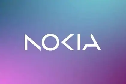
The Finnish corporation Nokia introduced a new logo and announced a further strategy
The Finnish telecommunications corporation Nokia on Sunday, February 26, introduced a new logo and announced a further strategy. This was reported on the company’s website.
Nokia President Pekka Lundmark noted that the corporation is committed to improving performance, sustainability and affordability. “We are sharing our updated company and technology strategy with a focus on unlocking the potential of networks—creating a future where networks meet the cloud,” he said.
Now the company’s distinguishing mark consists of five different shapes that form the word Nokia. It is emphasized that the recognizable blue color of the old logo has been replaced with a range of colors.
“The company’s new logo symbolizes an energetic, dynamic and modern Nokia, demonstrating its values and mission,” the Finnish corporation sums up in a statement.
In December 2022, it was reported that Nokia received an export license to supply equipment to Russia. It was not about the supply of equipment for expanding networks, but about the spare parts necessary to maintain the functioning of existing networks for three years. After that, Nokia plans to liquidate all its Russian legal entities and leave Russia within a year.
Source: Lenta
Mabel is a talented author and journalist with a passion for all things technology. As an experienced writer for the 247 News Agency, she has established a reputation for her in-depth reporting and expert analysis on the latest developments in the tech industry.


